Top 5 Web Typefaces To Follow In 2017
Still early days of 2017, but a lot of new design trends have surfaced and look promising. The industry has shown fresh signs emphasizing on layouts and content. The year will be dominated by rich bright colors and bold typefaces. Having said that, the importance of typography would only increase to a brand new level altogether. Today, it’s extremely difficult to catch user’s attention and thus typography will play a pivotal role in the process. Let’s check out some of the most promising web typefaces that are bound to become mainstream in 2017.
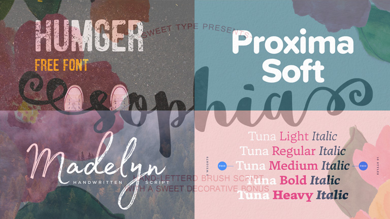
1. Humger
Humger typeface flaunts a grunge style with capital letters. The lowercase option isn’t available in it and only uppercase letters are available. It’s inspired by an old-school style with dirty effects in the body. Its shape expresses a strong character of urban style featuring narrow texture, smudge effect, and an authentic vintage character. It’s a great option for artists who wish to create an everlasting impact on viewers. This typeface is best suited for headlines, titles, and infographics.

2. Sophia
Sophia is distinguished by a hand-lettered style created by designer Emily Spadoni. In her own words, the typeface is “sweet, saucy, and little shabby” which makes it perfect for websites, infographics, and informal logos. Both uppercase and lowercase letters along with a set of special symbols are available. It portrays a perfect italic writing that induces a fresh feeling.

3. Tuna
Released in early 2017 by Felix Braden and Alex Rutten, Tuna has created quite a stir in the industry. Tuna is a serif typeface that can be used for magazines, books, and mobile applications with a well-defined calligraphic touch. The readability of Tuna is extremely good. There are five different weights (light, regular, medium, bold and heavy), available with italics. The serifs are a bit heavier and slightly arched ones, creating a dynamic structure and more contrast.

4. Madelyn
Madelyn is a handwritten typeface which is very similar to real handwriting. It evokes a notion of individuality and style. The typeface replicates calligraphy pen writing along with some casual dry strokes. It includes both upper and lowercase characters, numbers, a large range of punctuation, and symbols. It’s perfect for logos, branding projects, greeting cards, posters, titles, and almost everything that calls for a personal touch.

5. Proxima Soft
Designed by Mark Simonson, Proxima Soft shows off a rounded design that restyles the existing Proxima Nova. Proxima Soft includes 48 styles with eight weights in three widths and italics. It’s perfect when you are looking for something that is a bit more pleasant, more curvy, and playful than a traditional Sans Serif font. Considering the curvy style, this font is best suited for large headlines and eye-impacting words.

Trends will keep coming and impacting the overall lookout of the industry. It’s best to be abreast of the latest trends and use it to perfection. Talk to our experts today to know more about the latest happenings in the design industry and how you can use them to boost your business.
