4 Tips To Master The Art of Responsive Headers & Logos

The tech world has been extremely beautified with the implementation of latest high-end technical concepts and features. Jump into the internet world and you can witness a myriad of dazzling websites welcoming you at every click. Responsive design, headers & logos play a prominent role in the creation of delightful websites and it’s a commonly discussed phenomenon among the front end developers of today’s world. But it’s not a cakewalk to fully understand the concepts of designing responsive layouts as the subject is an ocean of knowledge and information.
There are tonnes of unique areas of a website which call out for attention but concentrating on individual elements will provide you an edge to fully understand the user goals. Once the user goals are carefully understood, it becomes easy to identify how these goals can be achieved using a responsive design.
In this article, we will cover website components like logos, headers, and navigation menus as they fall under the umbrella of a responsive design. Here are 4 important tips that developers should keep in mind while creating a responsive design:
1. Iconification of the logo
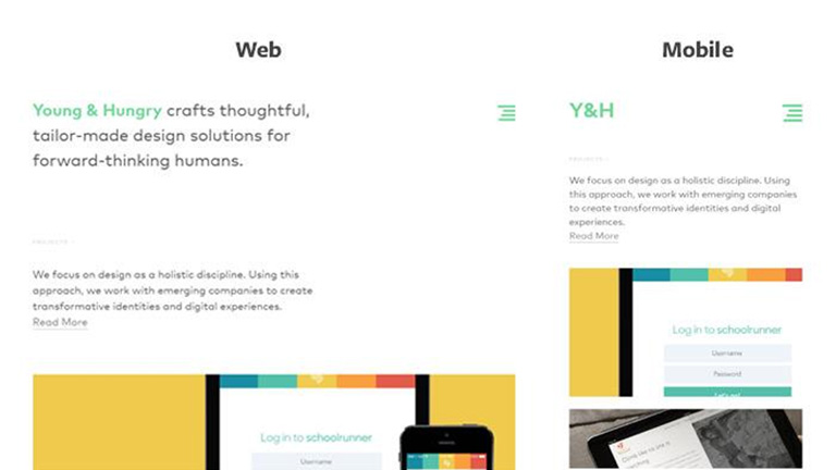
A logo is the most important element of a brand’s identity and usually contains a graphic, some text or an icon. This provides a leverage to iconify the logo into a symbol altogether. The header of a website is usually a bit cramped up and fitting in the complete logo of the brand isn’t appropriate. Agreed, that you might lose some glam and charm of a full sized logo but that isn’t a bad compromise for maintaining a clean responsive layout. In addition, you really don’t need to always rely on graphics for condensing the logo. Even the text can get condensed to create the effect. Check how Young & Hungry uses a bright green logo which condenses when viewed on a mobile device.
2. Use thin navigation bars
A big header seems alright on a large display screen but definitely not on a smaller screen of handheld devices. Native mobile applications usually have a fixed header and a responsive design follows the same practice. On smaller devices, the fixed header must also shrink down to display maximum content while still providing an easy access to the header & navigation. A dropdown box as a responsive view is another way to handle navigation, especially on a smaller mobile screen. Take a look at the image below. The header has related icons for all the text links. This looks absolutely fine on a widescreen but for a smaller screen, it’s too much of details. A dropdown option comes handy here.

3. Keep the navigation very simple and basic
It’s always a good practice to not make things too complex. When you revive the design for a smaller screen it’s best to keep as many links as you can in the navigation along with providing an easy access. This becomes challenging when you have a multi-tiered dropdown menu and hence you need to drop a few items. However, if you play a little smart, you can accommodate all of them. One of the techniques is to use a flyout menu showing sublinks in your responsive menu. A Hamburger menu is a necessity for websites that need to display lengthy navigation menus and it’s perfectly accepted as a menu button by the smartphone users. It simplifies the process of navigation by providing more clickable area and large link text.

4. Keep the focal point always visible while dealing with full-screen backgrounds
A full-screen background certainly draws a few extra eyeballs but it again works best on large monitors. The designers usually remove the background image after a certain breakpoint or the image realigns itself as per the screen size. The key is to maintain the focal point in view at all times no matter what the screen size is. It needs some CSS positioning to implement this solution and is fairly simple once you get a hang of it.

As mentioned earlier, the topic of responsive designs is deep as an ocean and there are umpteen other tips and tricks which could be implemented to create a scintillating web design giving the same delightful experience across all screen sizes and resolutions. Let our web design experts create that perfect website for you. CONTACT US TODAY!
Pic Courtesy: Hongikat
