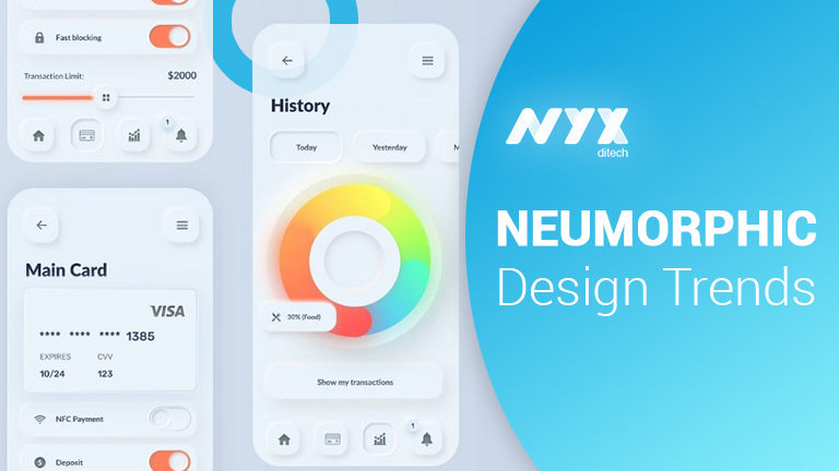
Neumorphism: A Growing Trend In The Design World

Designers love trends, especially good ones, and the design world keeps presenting them with new trends in abundance. Neumorphism is one such trend that’s been buzzing around for the last one year. Though it sounds like a medical term, it is a hot new design trend that could be a big one in the near future. Flat design and Material design have been dominating the interface design looks for quite a few years. Then came iOS 7 and rooted out the then prevailing trend for skeuomorphism.
Skeuomorphism And Neumorphism
Skeuomorphism is a term most often used in graphical user interface design. It describes interface objects that mimic their real-world counterparts in how they appear and/or how the user can interact with them. A well-known example is the recycle bin icon used for discarding files. Skeuomorphism makes interface objects familiar to users by using concepts they recognize.
Neumorphism combines developments of flat design and skeuomorphism. Neumorphism, or soft UI, is a visual style that combines background colors, shapes, gradients, highlights, and shadows to ensure graphic intense buttons and switches. All that allows achieving a soft, extruded plastic look, and almost 3D styling. The name was coined by UX designer Jason Kelley.
Neumorphism focuses on a new element of the entire design style. This focus is not necessarily on the contrast or similarity between the real and digital worlds, but on the color palette. Neumorphism is all about the color of the entire screen and delivering an entirely unique experience for users. With Neumorphism, you’d be creating a soft interface, in which the UI elements aren’t placed on the background – but behind it.
It gives a feel that components like buttons or cards are actually inside the background, and are only visible because they’re protruding from within. The general style is all about solid colors, low contrast, and the right play of shadowing.
Key Difference
Common modern UI elements and components, such as material ones are floating surfaces. They are highlighted by appearing on top of the design background. They also cast a shadow on it, thus giving the sensation of floating. On the other hand, neumorphic elements do not appear to float; instead, they give the impression of surfacing out of the background. This is possible because of two reasons:
Firstly, the main principle behind neumorphism is that the background color must be the same as the element color.
Secondly, to make the elements appear as they are extensions of the background, the highlighting part is done by using a simple, but subtle effect. Each UI element has two shadows projected onto it, a light shadow on its upper-left corner and one dark shadow on its bottom-right corner. This gives the impression that the light source is located somewhere in the top-left part of the screen and casts a shadow on the lower right part.
Neumorphism: Cards And Buttons
Neumorphic cards are different from other design styles that we are familiar with such as cards in Material Design, for example, because they don’t look like they are floating. There is no shadow to create that floating effect, not even when the user hovers above that card.
That’s because they extrude from the background, creating a raised look. The way to achieve it is by taking the light and dark shadow you’ve established that will accompany the background and using them on opposite sides of the cards. You can play with the positioning of these two shadows, so it feels as if the cards are seen at certain angles by the user.
Challenges With Neumorphism
You can apply Neumorphism to a mobile app, desktop, or web one. Yet, there are some issues regarding accessibility/visibility, particularly buttons. Thus, buttons may have not enough contrast to be easily spotted for people with vision impairments. Some problems may arise with poor quality screens or lower screen brightness/contrast.
Also, some issues occur regarding ways to efficiently code components, customize buttons, input styles based on the concept of Neumorphism. There are few libraries so far, but new ones are beginning to emerge:
- React Native components based on the concept of Neumorphism (iOS only).
- Neumorphic UI, a library of components based on the concept of Neumorphism.
- Neumorphism.io, soft-UI CSS code generator
Accessibility
Neumorphism might seem futuristic but has some major drawbacks when it comes to accessibility.
User interfaces should be accessible to people with disabilities, regardless of the platform. People with auditory, cognitive, neurological, physical, speech, and visual afflictions should be able to use any given application with as little assistance as possible. Neumorphism lacks support for people with cognitive and visual disabilities, as we will see next.
Neumorphic interfaces are monochromatic and lack in contrast, relying mainly on the use of shadows to emphasize elements. What this leads to is a lack of visual hierarchy and focal points. Since cognitive disabilities impact how people process information, mainly their perception, memory, and attention, this design approach could result in confusing and hard to use digital products.
A good user experience is one that doesn’t make users think, one that guides their eyes through the content. The subtle contrast that characterizes neumorphic design makes it hard for users to perceive hierarchy. User interfaces should be straightforward and intuitive.
Neumorphism was born out of skeuomorphism and minimalism, but aims to deliver experience users have never been through. Neumorphism, like many other styles, is a simple building block of the future. Want to know more about the latest design trends? Talk to our experts.
Read about the design trends of 2020 here

