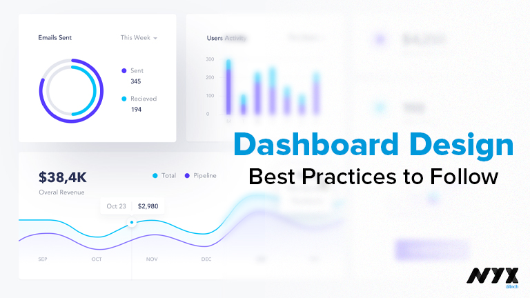
Dashboard Design: Best Practices To Follow
In today’s data-driven era, the capability to consolidate and present data while making it understandable and practical is more critical than ever. Dashboards are being used by everyone from data analysts to the highest-ranking executives for comprehensive analysis of information and to gain insight into it. The goal of a good dashboard design is to bring together all the data needed to achieve a certain goal.
In this blog, we have compiled the best practices followed by product designers while designing dashboards for any application.
Types of Dashboard Design
Operational Dashboard
An operational dashboard aims to provide users with an overview of what is currently taking place. With real-time data updates and displays, these dashboards enable speedy responses from users. An example of an operational dashboard use case is software monitoring, in which the dashboard user seeks immediate notification when something goes wrong.
Analytical Dashboard
With the help of analytical dashboards, it is possible to track trends over longer periods of time and utilize that information to make better business decisions. These dashboards provide data that is less time-sensitive and will not demand immediate action. A good dashboard developed by interface designers should make it easy for consumers to dive down and investigate any data that piques their interest.
Strategic Dashboard
Strategic dashboards are a higher-level sort of dashboard that is used for long-term planning and strategy. They may be used to monitor the outcomes of long-term business initiatives and industry-wide developments. The user experience design of this dashboard is to make it easier for executives to grasp the concept without having to go into depth.
Dashboard Design: Top 5 Best Practices To Follow
Information Hierarchy
Your dashboard’s data should be arranged in a sensible fashion. This implies that the most significant facts and insights should be placed at the top left of your dashboard so that they have the highest opportunity of attracting the attention of the user. All other information on the dashboard should be prioritized accordingly. It’s important to include supporting information or trends in the footnotes.
A Consistent Design Pattern
Having a uniform dashboard-style makes it easier for users to receive the information they need quickly and efficiently. Whether it’s the dashboard itself or the charts, this applies to all aspects of UX designing. All of the chart’s labels, legends, axis style, and other tools should be located in one location.
A dashboard allowing a sales representative to have a rapid overview of a client account is a great example. In an ideal world, the dashboard should appear the same for all clients in terms of the layout so that a sales professional can still obtain a rapid overview of a firm even if they are new to the organization.
Provide Context
Dashboard users should never have to assume or make assumptions about what they’re seeing. Make sure charts include names and maybe subheadings to describe what they’re showing. To make it clear to the audience what the data represents, legends and labels should be included.
Interactive components, such as tooltips that appear when a user hovers over a data point, are an excellent approach to add extra insight without clogging up your charts. People only see extra information when they choose to.
5-Second Rule
When it comes to dashboards, the general rule of thumb is that the user should be able to locate any information they need in less than five seconds. If not, the user will immediately shift to alternate solutions. To begin, eliminate all visualizations that aren’t directly related to the dashboard’s primary goal in order to declutter it. As a second approach, you could arrange the dashboard by adding labels and names on the essential areas so that people can quickly discover what they need.
After making these adjustments, if the dashboard is still too complicated, you should breakdown it into numerous smaller dashboards, each with a distinct focus.
Performance
The performance of dashboards is often overlooked while developing dashboards. It doesn’t matter how good the design is if the performance is awful, such as slow loading speed, the end-user will not appreciate it.
Final words
There are many challenges in data visualization and designing dashboards is one of the most useful skills for designers to have. However, if you keep the aforementioned guidelines in mind while designing any dashboard, you’ll have a solid starting point. Contact our design expert today to evaluate your dashboard’s design.
Read more about styles you should follow while designing frontend, here.
