Gestalt Design Principles: How Psychology Affects Perception

Gestalt Design Principles are visual recognition concepts that describe how we put similar parts together, discern patterns, and simplify complicated pictures as we view objects. Using gestalt design principles, any creative design agency may create user interfaces that are both visually appealing and intuitive to use. Let’s take a closer look at these design principles in this blog.
Similarity
It is natural for humans to group similar items together. Visually comparable elements are grouped according to gestalt design principles, regardless of how close they are to one another. Color, shape, and size are all valid ways to organize them. In a design, similarity may be utilized to connect items that aren’t directly adjacent to each other.
If you want anything to stand out from the crowd, of course, you may make it different from the others. So, in order to draw the visitor’s attention to the required action, call to action buttons are frequently made to stand out from the background color of the website.
Continuation
According to the rule of continuity, no matter how lines are drawn, the human eye will always follow the smoothest path. When the intention is to drive a visitor’s gaze in a specific direction, this continuation may be a useful tool. For this reason, it is important to make sure that all of the most important components of the page are within their reach.
Placement along a line naturally draws attention from one object to the next because of the eye’s tendency to follow a line. Horizontal sliders and similar product displays on sites like Amazon are two examples of this.
Closure
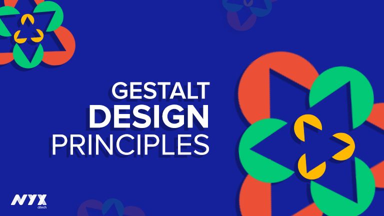
One of the most fascinating gestalt concepts is the notion of closure. It’s the assumption that your brain will fill in the gaps in a design or image to produce a complete picture. One of the most well-known examples is the dotted outline where individuals are more likely to notice an overall form rather than individual lines.
Other examples include the logos for Sun Microsystems, USA Network, and Adobe. The closure is a common theme in logo design. Using a fade-out graphic to remind users that there’s more to be discovered if they swipe left or right is a great example of how to utilize closure in UI and UX.
Proximity
Proximity refers to the distance between two or more objects. Even when overlapping subjects have the highest proximity effects, just putting things together into a single region can still have a significant proximity impact. Of course, the inverse is also true. Even though the features of the two elements are identical, you may create a sense of difference by separating them by putting space between them.
Logo design experts commonly employ proximity to encourage the grouping of items without the need for physical borders. If you group similar things together and leave space between them, the audience will quickly notice the hierarchy you’re trying to convey.
Conclusion
As long as you follow the basics of Gestalt design principles, it’s possible to transform a disorganized site into one where visitors are guided toward taking the desired action by a smooth and natural experience. Contact Us today to know more.
For Further Readings: 5 Web Design Principles To Improve Conversion Ratio

