Use Video And Movement To Exemplify User Experience

The ever-changing world of UX web design has witnessed a plethora of changing trends over the last decade. With a new year, we expect a lot more changes, and new design trends will come to the surface. If you look back to your user experience with websites over the last year, you would probably be able to think of a few websites which really stood out and few which were absolutely shady, in terms of user experience. A bad user experience leads to a negative brand image. Therefore, it’s very important to move along with the changing trends, in order to keep up the user experience level, or even enhance it.
You might have noticed that a lot of designers these days are taking help of video, visuals and movement in order to enhance the UX of a website. It not only enhances the user experience, but it also makes the website more appealing. Here are some of the ways in which you can use video and movement opportunities to grab the users’ attention and keep visitors on the page for longer periods of time.
Non-Traditional Scrolling
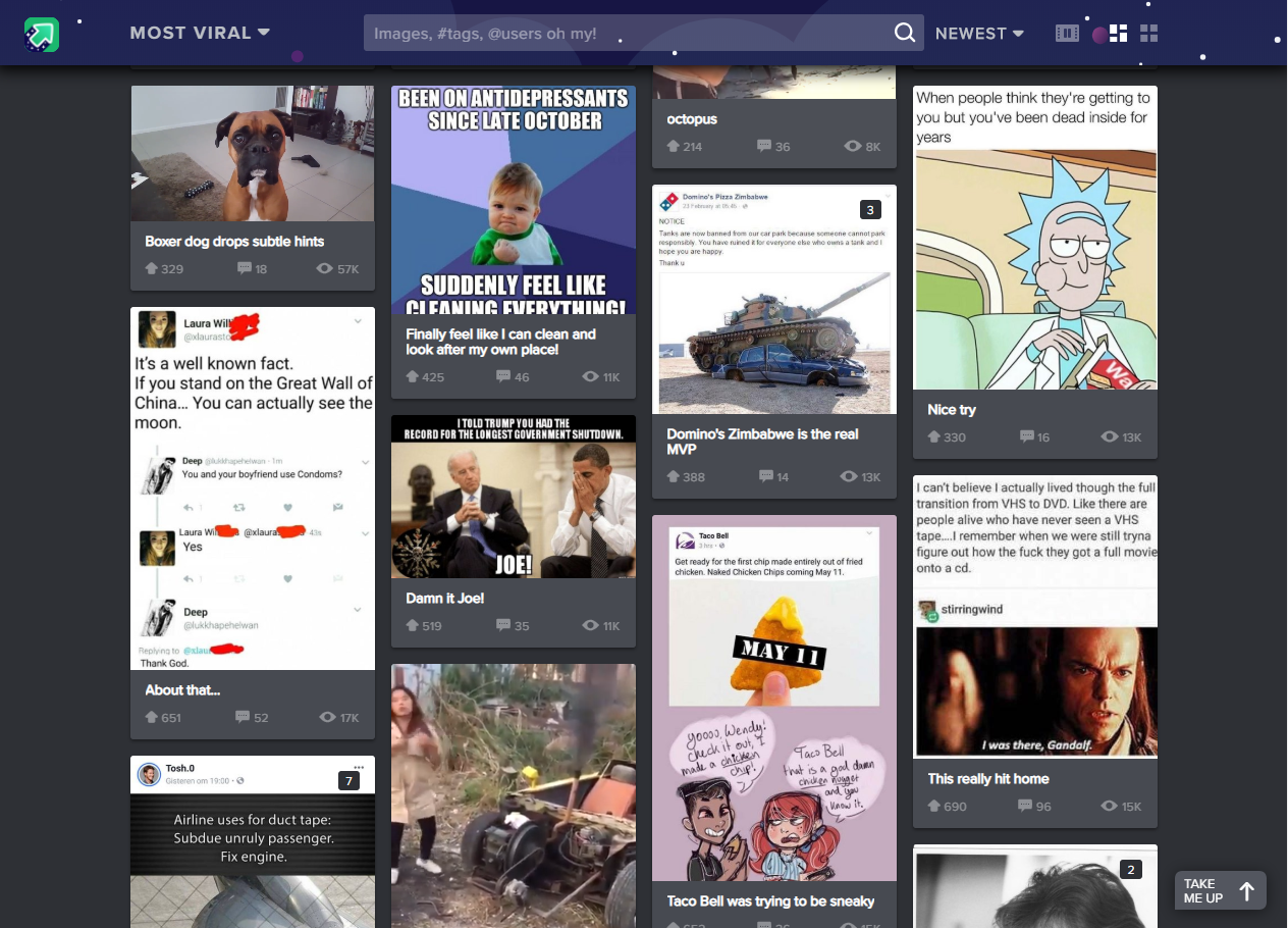
More and more websites are now experimenting with different scrolling techniques to create a unique user experience. Instead of using the conventional vertical scroll designers can try out other non-conventional scrolling patterns like long scrolling, fixed long scrolling, infinite Scrolling, or tasteful parallax scrolling. Creative scrolling patterns let you adjust the pace, delivery, and interactivity of the content. Considering that our attention span on the web is less than 10 seconds, a delightful scrolling experience certainly prolongs user interest. Take a look at the imgur website. It uses infinite scrolling pattern, which loads the content as needed to provide a more paced experience. Infinite scrolling proves useful for single-page sites with more than a few screens worth of content, especially with multimedia galleries.
Rotating Animations
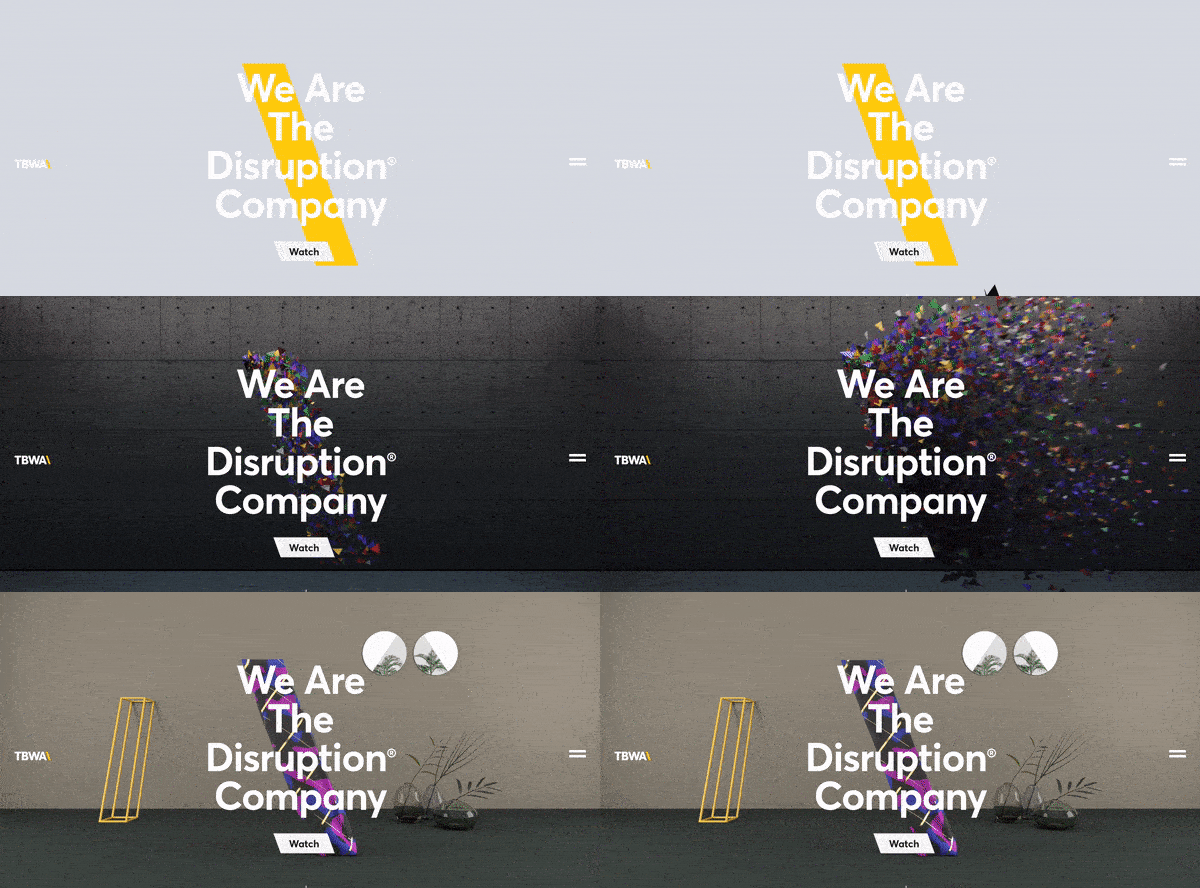
The best web design strategy that will keep users coming back to your website is the Switching Strategy. The more you keep switching your content, more the people will be intrigued. See the Disruption company website. It leaves users curious for more because every time you refresh the homepage you’ll see a new and innovative brand video they’ve created for the homepage. We’ve seen some brands rotate the titles of articles or call-outs as well. These options could leave users with a unique experience on your website every time they visit.
Interactive Web Designs
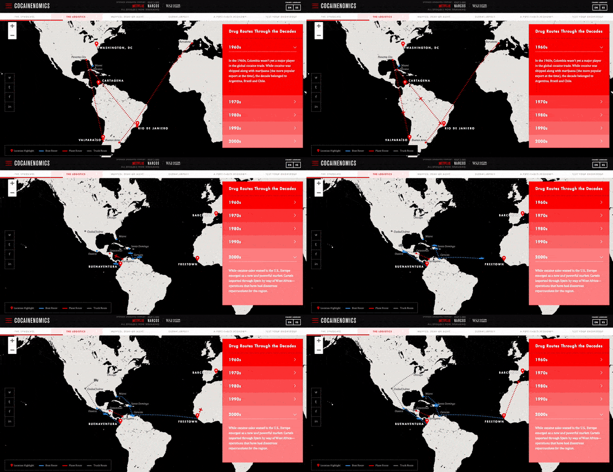
The inclusion of user interactivity has become more popular and will only continue to grow. Users are spending more time on pages of responsive websites that utilize features with user interactivity. The hindrance with this UX design trend is that the clients hesitate to pay for the advanced interactivity. Even if their own team wants to include features like these, they still shy away. Our team predicts more automated development processes will appear and will hopefully cut the cost for clients who want unparalleled, interactive features on their sites. A great example of user interactivity can be explored on Cocainenomics from the Wall Street Journal. This type of web design not only showcases a visual design talent, but it increases the website’s time on page and brand awareness.
UX-Driven Diagonal Lines
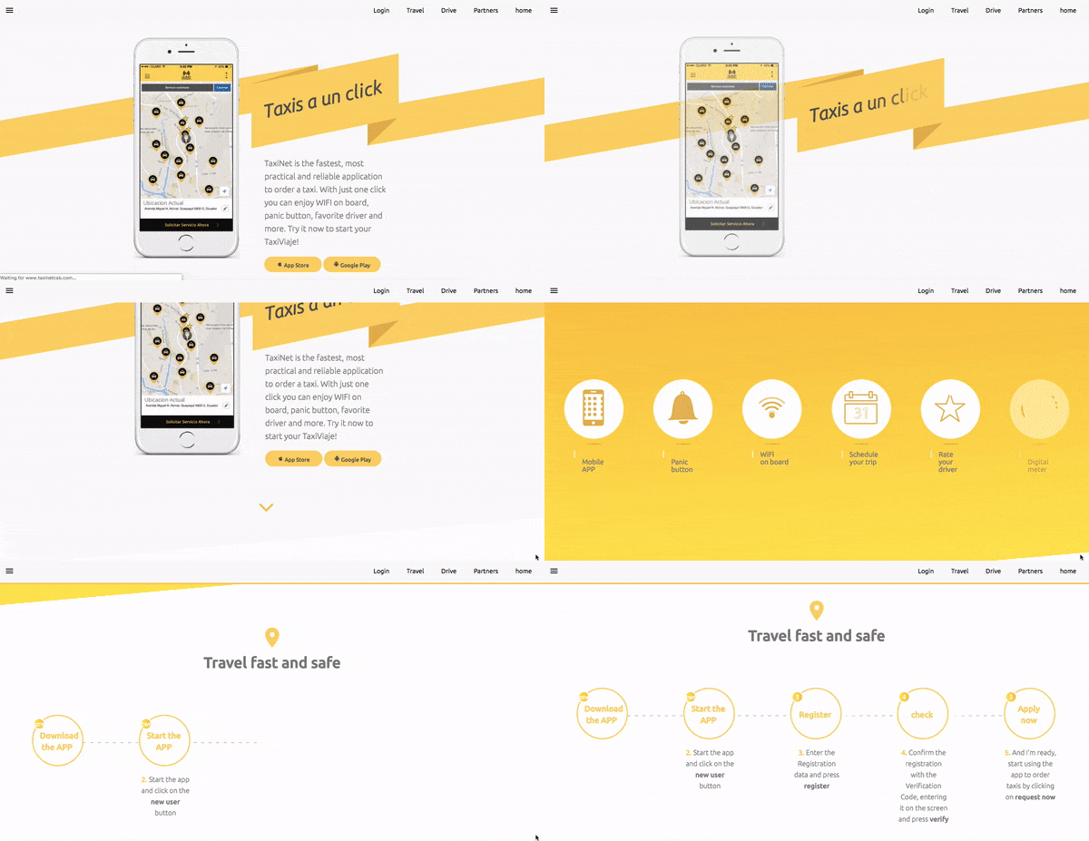
Over the years, it has been a common trend to use straight, horizontal lines to distribute sections on a website’s page. A lot of UX research was done on the topic by various design experts and their teams which discovered that using diagonal line design is not only visually intriguing, but it facilitates the visual flow of users. it guides them to follow down the page or to points to a call-to-action. Using diagonals in your designs will increase the number of users that scroll through the entire length of the site. TaxiNet has beautifully implemented this trend on their website to enhance the user experience.
Large, Eye-catching Titles
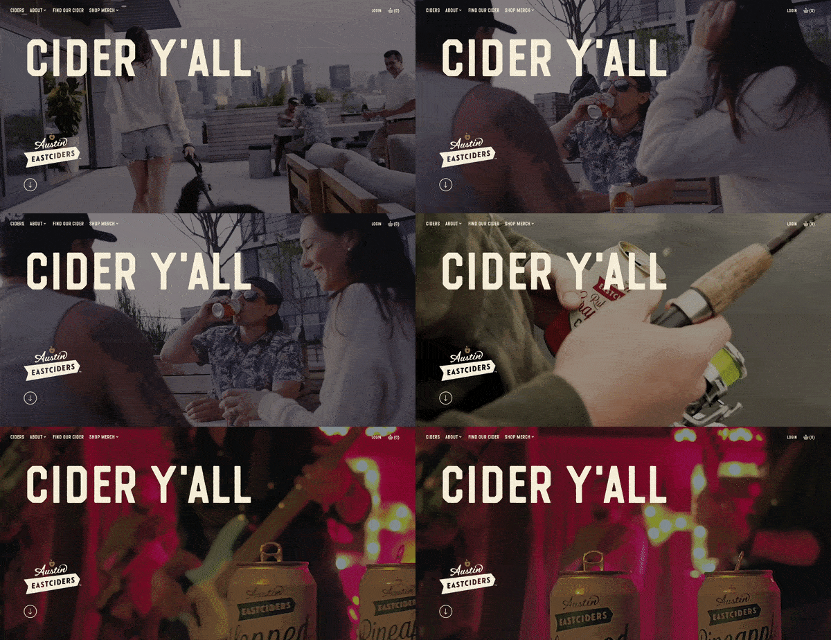
Today, we live in a hustling and bustling society, which is always on a move. Users seem to have less and less time to spend on websites due to their busy lives. Therefore, designers have identified the need of creating a design which instantly grabs attention and conveys the message right at the start of user interaction. They are adapting and including large, bolded titles and shortened messaging to capture their audiences and expedite their time to convert. The increased size of these heading tags is usually matched with much smaller sub-text copy if more information is desired. Austin Eastciders demonstrates this alliance of font sizes throughout their homepage design and uses a video in the background to showcase different occasions to enjoy their tasty ciders.
A lot is changing in the world of design. Rich user experience is no longer a luxury; it’s more of basic and elementary. Speak to our design experts and learn how you can infuse visually appealing design elements which elevate the user experience.
