Designing For Kids: A Different Ball Game All Together
If you think that kids are not exploring the web, you are probably living in a different world. Technology advancements and exposure to the internet with changing times has created a rapidly increasing, new category of the audience – kids. Designing For Kids is a whole new ballgame as compared to designing a website for adults. Unlike adults, children aren’t looking for information on a website. They’re looking for some fun and happiness. A website for kids needs to focus on engagement, entertainment, and education. It can be in forms of games, videos, puzzles, or stories. Here are a few tips and tricks to follow when designing for kids.
Design for various age groups
Targeting the specific age group of children is crucial. According to some researches, children are very aware of age differences and do not enjoy engaging with something they feel is for the ones younger or older to them. Therefore, it is very important to offer tailored content.
Ages 3-5 will be enticed by bright colors and sounds, along with cute characters, and themes around nature. Jump to ages between six to eight and things start getting tricky. Kids in this category seek recognition that they are above younger children. Bright colors still work, but with added depth. Graphics and images become denser, and the characters are more human-like.
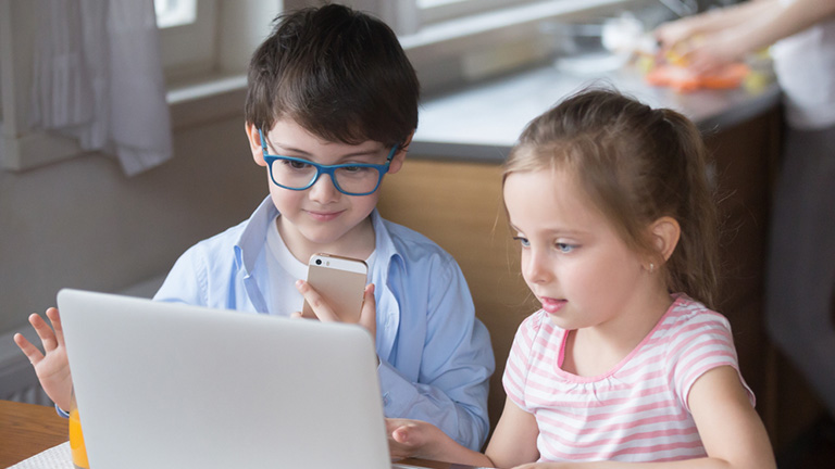
Children aged 9-12 are much proficient with the internet and are generally attracted with websites which look more or less the same as any other website for grown-ups. The typography stays simple and color-saturated, palettes become more complex, and word structure should be more traditional.
Be bold and bright
It’s no rocket science that kids love anything and everything which has bright colors in it. Colors excite them and make them inquisitive about things. Spread your colorful, creative wings while designing a website for the kids. Use lots of vivid and vibrant colors to grab attention. Red, blue, yellow, green, purple and orange are all happy colors and must be used as primary and secondary colors.
When designing for the kids, think like kids. Have fun with bright colors, and break the rules and monotonous approach. It’s all about grabbing those little eyeballs and making them stick to your website for as long as possible.
Use visuals more than text
Visuals have a deeper impact on humans as compared to text, be it grown-ups or kids. The impact of visuals is more on kids as compared to adults; it offers a great opportunity for designers to be at their creative best. Kids recognize symbols before the text. A six-year-old is virtually on the verge of learning to read, but older kids recognize text and visuals both. They are more inclined to visuals then grown-ups.
Visual cues are more effective than text at some parts on the website like icons, tabs and other areas where they can, or are required to take action. Use large buttons and graphics instead of text; make them obvious and oversimplified in order to clearly stand out.
Go easy on the language
They are kids, communicate with them in a language they easily understand. There is no need to use words they are not familiar with, even if these are the most commonly used words for a particular section, tab or activity.
One of the most commonly used words on a website is ‘submit’, which is used to capture information. However, when it comes to kids, we can replace it with another simple word, like ‘done’, which makes more sense to them, and they can easily relate to it. Similarly, ‘sign up’ is way too hard for them to comprehend and understand the purpose. A simple ‘go’ button is enough for them to understand the purpose and result of the action.
Read More about how to design CTA buttons
Avoid making them type
Which kid would like to keep tapping keys on a keyboard? Be aware of the motoric skills of your target audience. A keyboard and a mouse is very basic for adults, but that’s advanced and a cumbersome task for a kid. Young children are more comfortable with touch sensors to take actions rather than typing. Replace elements which require typing with elements that support touch or slide.
For example, if you are trying to capture the age of the user, instead of an input field, use a slider. Kids would love sliding forward and backward rather than typing their age in the input field. It’s fun sliding, and you can cash on that.
Create a happy and vibrant mood
Children always look forward to a happy experience while they are browsing a website. We discussed earlier how bright colors make kids happy; try to create an overall happy environment on the website. Use smiling faces, cheerful characters, energetic gestures, and positive words to provide an amazing experience packed with fun and friendliness.
Almost every kid is familiar with Disney and Peppa Pig characters. Every single character wears a smile almost every time. Use these characters on the website to offer a sense of friendliness and welcome. The Disney characters are always smiling, looking directly at you, which is a very jovial feeling. Similarly, Peppa Pig characters are always doing some kind of activity, like reading, playing, dancing, etc.
These characters are charged with energy, they are always smiling, create an engagement with the audience, and are a perfect role model for kids.
Kids are a niche audience, but they are increasing in number as fast as they can. Children centric businesses are on the rise and are expected to grow faster than ever. Understand your audience, put yourself into their shoes, think like them, and most importantly break the shackles of commonly used practices. Kids are different, and they need a tailored website. For more information, talk to our design ninjas now!
