Card UI Design: Tips and Fundamentals

With an increase in access to the internet through mobile devices, designers have been focusing more on creating designs that render well on both desktops and mobile devices. People have switched to the use of multiple screens, and as designers, we need to accommodate the varying device usage of our visitors. The card layout is one such element. Cards are box containers that hold pieces of information. Recently, this simple card UI design component became an essential part of the web and mobile design, and thus needs to be done right to offer a rich user experience. Cards are everywhere – from social media sites like Facebook and Twitter to eCommerce stores like Amazon. Card layout has rapidly gained popularity. In this article, we will review the concept of cards, understand its fundamentals, and share some practical tips for designers.
What Are Cards?
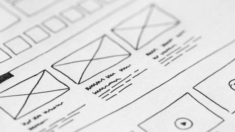
Cards are a UI component containing content and actions about a single subject. Cards can contain several different elements, but they all should be about a single topic. The logic behind this is to avoid long texts and render more scannable content. Even though users might not be familiar with a card’s concept from a design point of view, they instantly know how to use them since they are similar to physical cards.
Popularity of Card UI Design
Card UI design is popular for many reasons:
- Solves navigation problems
- Intuitive
- Easily scannable
- Offers multiple uses
- Effective and user friendly
A typical card layout features the following elements:
- Imagery – Images or videos that scale to fit the top area of a container.
- Title – Primary heading
- Summary – A brief synopsis of the unit.
- Actions (optional) – Actions associated with the unit.
Fundamentals of a Good Card UI Design
Well-designed cards make it easier for users to scan the available information. Here are the fundamental principles of good card design:
- Single-subject: Each card must represent one idea, topic, or product. A card covering multiple ideas or topics can confuse a user and hence is not recommended.
- Efficient: Avoid overloading cards with extra information or actions. Each card should contain only essential information and actions.
- Meaningful: Each card should contain information that helps users make a decision.
- Clear: The layout of a card affects how it is perceived. Each card is made up of content blocks (elements like text and images). Content blocks should be placed on a card in a way that clearly indicates hierarchy.
- Independent: A card should stand alone, without relying on other cards for context. A card cannot divide into multiple cards.
- Responsive: Since the website and apps are accessed on different screen sizes, the cards should be responsive and must resize to fit into the available space.
Tips For Card UI Design
Use It For a Purpose
While cards are an excellent UI element, don’t use them just to make your website or app more presentable. Use it for its real purpose i.e., to organize varying types and sizes of content elements. A card layout works best when you have multiple content types like images, texts, CTA buttons, etc. When you have content types of variable length, and there is some interaction like a link, like and share buttons, etc.
Don’t Complicate – Keep it Simple
As stated earlier, stick to one thought per card. You can use multiple elements like images, text, links, buttons, etc. However, they all should constitute one thought or action. Don’t overload the cards with extra information or actions. And, limit the amount of text in your card. Don’t add paragraphs of texts.
Use Relevant Images
Visuals and imagery are key elements of card-based design. Visuals are the first thing users notice when they scan a card. Therefore, it’s critical to select a relevant image for our cards. The image should allow you to communicate the meaning of a section (card) at a glance. Ensure that all the graphics are appropriately displayed across different sized platforms since they are going to scale as per the platform.
Clearly Indicate Interactive Elements Within a Card
In case the UI card contains interactive elements, it’s vital to indicate such elements clearly. It is recommended to use visual dividers to separate individual regions in cards. Dividers can be either visible or created using whitespace around each block to make it easier for users to separate different sections.
Reveal More Information Using Parent-to-Child Transition
Cards are transformable UI components; they can transform and change to show additional content to users. The card should always expand to fill the screen with additional information. When it comes to animated transitions, it’s recommended to avoid fancy animated effects such as flip over. This kind of effect demands too much attention and is bound to irritate and annoy users if they see it repeatedly.
Support Micro-Interactions
While cards are interactive elements that point a user to the more detailed information, a little bit of micro-interaction on the card will boost the experience. You can use micro-interactions when the user hovers the mouse on the card, clicks a link or a button.
Wrap Up
Creating a good card UI design is all about creating an intuitive browsing experience for your users. Card UI design is one of those skills that allow you to solve a wide array of UI design problems once mastered. Wish to discuss more about card UI design? Talk to our experts.
Interested in Website Layout designs? Read here

