5 Best Practices To Design Exceptional Buttons

When we start listing down the elements to consider while designing a web page, the list surely goes on and on. There are numerous basic elements and then there are the complex ones. A designer always tries to cover most of the elements contributing to the user experience. However, often in a quest to get his hands on every element, the most vital elements are missed out. Consider Buttons; they are one of the most common elements of an interactive design. Even though they are the most basic ones, they are surely the most important ones. Here are 5 important tips to design better buttons.
1. Buttons Should Look Like Buttons
It’s pivotal that the users recognize a button in the first look itself. Visual cues guide users to determine clickability of an option. When it comes to shapes, a square/rectangular shape is universally used and is probably the safest bet. A square/rectangle with round corners is another popular variation. You can experiment with other shapes (round, oval, triangle etc.) as well, but the risk factor is slightly higher with these options.
Regardless of the shape that you select, the key factor is to maintain consistency across the interface controls. The consistency might not add wonders in terms of design, but users will surely get a familiar experience which is critical. Use Drop-shadows to make the element stand out against the background to make it identifiable as a clickable or tappable element.
2. Label The Buttons Appropriately
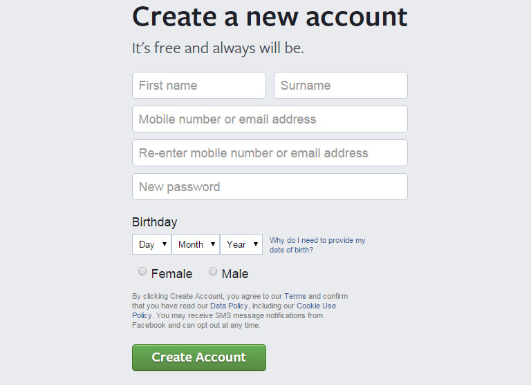
Another important thing to remember while designing buttons is to label them properly. A button must clearly send a message as to what will happen if someone clicks on it. Avoid vague labels like “Submit” or labels that don’t provide clear information. Users must know exactly what will happen when they click on the button. For example – “Create Account” button during the new sign up procedure clearly indicates the specific task.
3. Place The Buttons Properly
Users should never waste their time in looking out for buttons on your website. Place the buttons exactly where users expect them to see. In case of a native app, you should follow platform GUI guidelines while selecting a proper order and location for buttons. Applying a consistent design in terms of user expectations saves their time.
While designing web-based apps, you should try to figure out which placement works best for your users. Use testing methods to determine the same.
4. Keep The Interaction Between Users And Buttons Very Simple
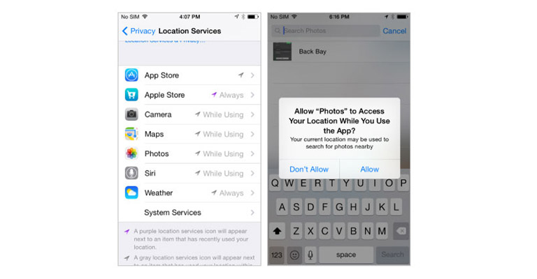
Visual feedback and size of a button play the most important role in user interaction. The size of a button should be in relation to other elements on the page. At the same time, it should also be large enough for people to interact. According to a study, the average size of fingertips is 8–10mm, average size of finger pads is between 10–14mm that makes 10mm x 10mm a good minimum touch target size.
Usually, a button has multi-states, and thus providing visual feedback to users indicating the current state should be an utmost priority task.
5. Primary action Button Must Have Strongest Visual Weight
The most important buttons must be clearly identifiable with the help of visual distinction. If there are two or more buttons in your view, (e.g. dialog box), the primary action must have strongest visual weight. Distinguish between the two options clearly, by using different visual weight for each button.
Let’s get this straight! Buttons are not just Buttons for heaven sake. They represent more than mere boxes and tabs. Explore more about buttons and web designing from the User Experience point of view. Talk to our experts today.