Tips To Design An Amazing Ecommerce Product Page

The most important element of any ecommerce website is its usability. The user journey, from product display to check out, is a long process and there are so many elements involved in it. Therefore, it becomes crucial to address the usability of every web page of your website. Product pages are very tricky to design. More often than not, designers lose out at the usability front while ensuring that the products are displayed as best as they can be. Here are a few tips to design a successful and appealing product page for your Ecommerce website.
1. Add an Alluring, Strong CTA Button
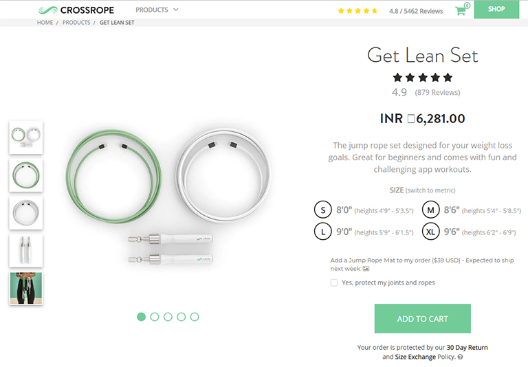
This is probably the most important part of any ecommerce product page. A page’s call-to-action button is the crucial element that draws interest and entices a user to take an action. On a product page, this should be your “add to cart” button. It’s the one thing that’ll get people moving through your funnel to actually convert, which is the primary goal of any ecommerce website.
Take a look at the product page of Cross Rope. They feature a pretty simple design and the clear CTA button is colored bright green which immediately grabs attention and stands out against the background. That’s exactly the job of a “add to cart” button. For all CTAs, you ideally want to select a color that grabs attention and differentiates itself from everything else on that page. That said, its essential to blend the colour into your layout and make it feel natural.
2. Price Must Be Easily Visible
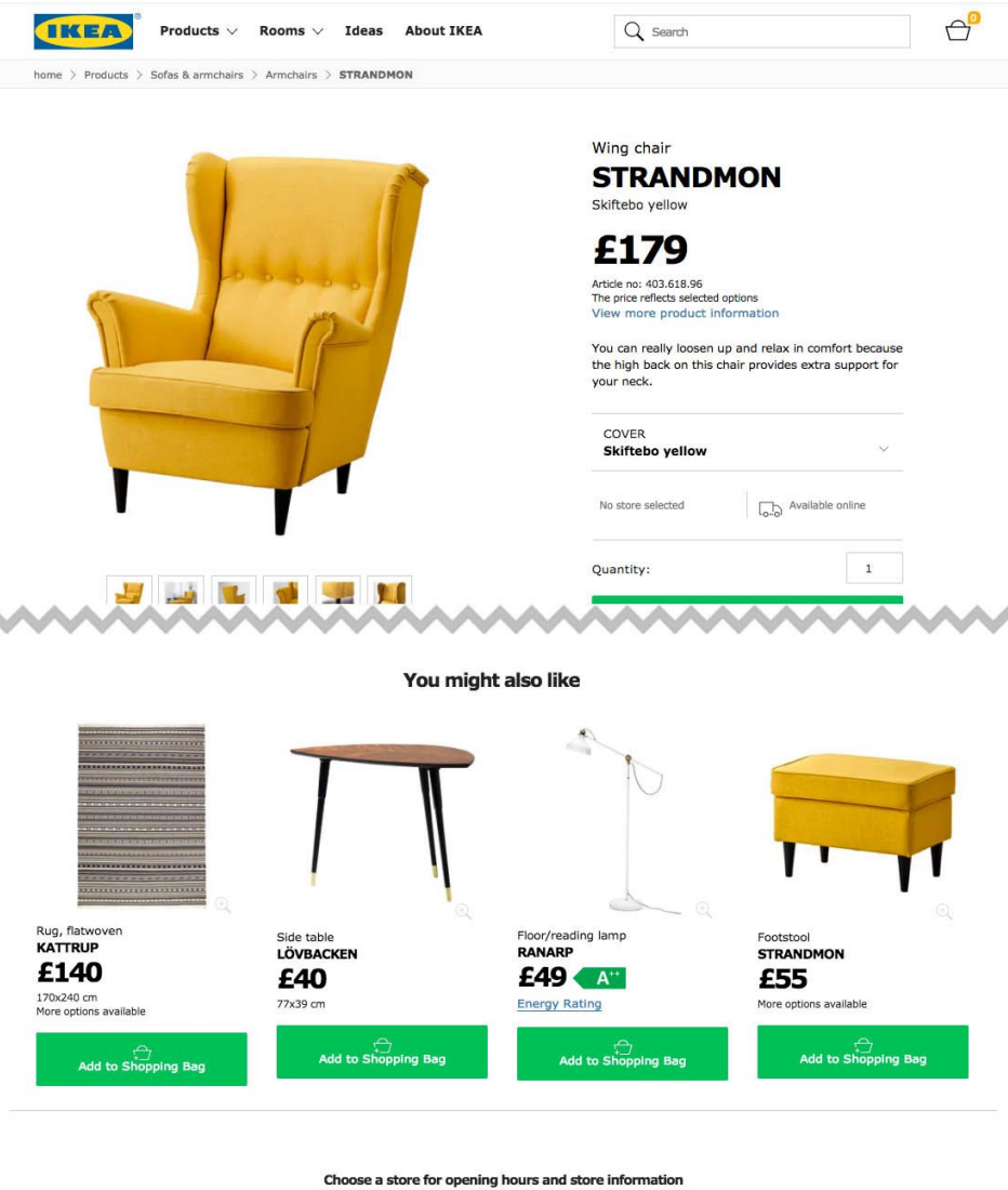
One of the biggest roadblocks to entry for most customers is the price of a product. No matter how much they like what you’re selling, but if it’s too pricey then it’s just not an option. Some designers think it makes sense to hide the price so users won’t notice. Well, that’s an awful idea. It is very obvious that at some point in time you will need to show the price to the customer and chances are more that he will not buy it. On the contrary, you want your price to be clearly visible and accessible at a glance. Give visitors the info right away so that they waste time looking at a product they can’t afford or just wouldn’t buy.
Take a look at the below image. You really don’t need big red text for your product pricing but it should be clearly visible at a glance. The best color and positioning for your site will depend on how your layout is structured.
3. KISS – Keep Information Short & Skimmable
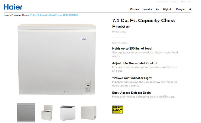
We often come across so many ecommerce websites with heavily detailed product pages because of which it becomes very stressful for users to read through the information. As a web designer, you should know that people don’t really read the entire content but they actually skim content and quickly look for what they need. Therefore it’s best to provide them with required information upfront, in the style they prefer. Crucial information on a webpage must be organized into page sections. It should be easily visible, easy to read, with clear language and very few obstructive page elements. Check out the Haier’s design. It has a list of features in bold text for the key points. These work like mini-headlines where the content is dark, bold and super easy to read. A great design choice that places attention on the consumer’s needs.
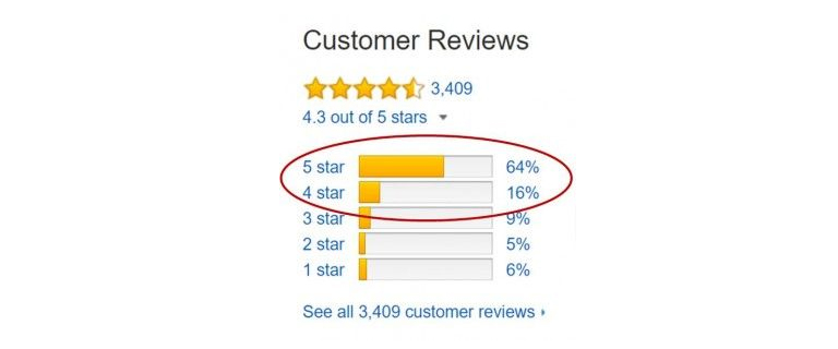
4. User Reviews & Ratings
A product is easy to sell if it comes with a social approval stamp. Product reviews are incredibly valuable and most ecommerce platforms use this feature. You should highly encourage user reviews and push these towards the front of the product page whenever you can. Most ecommerce sites rely on a star-based rating system which works well. This gives a visual indicator of what most buyer’s think of the product. Visitors can quickly go through the star ratings and then see how many people have left used and reviewed a particular product. If you only see 2 or 3 reviews then you know the star rating isn’t really reliable. However, 30+ reviews mean that this is a good basis to gauge the product’s value. We can find this on plenty of ecommerce sites including Amazon, the king of modern Internet retail.
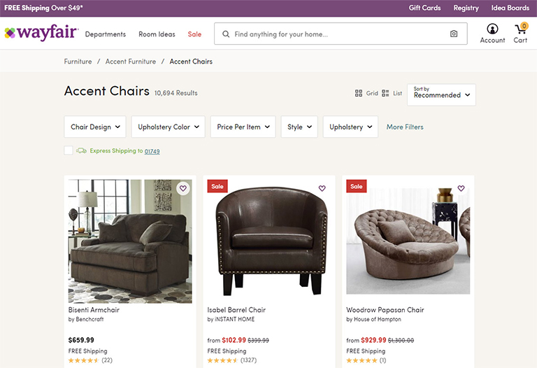
5. Clear Breadcrumb Trail
Another popular feature that many Ecommerce product pages have is breadcrumbs. You can add breadcrumbs to any page with ease and they don’t require a lot of space. In fact, they often take up empty space you never use. The benefit of a breadcrumb is the increased user engagement with relevant links to top-level parent categories for each product. Your goal should be to design similar breadcrumb-style navigation bars. But again, usability is key to everything and therefore your links should be easy to read and the breadcrumb categories should make sense.