7 Website Layouts To Highlight Your Content

It’s rightly said that ‘Content Is The King’ and therefore it becomes crucial to display content on a website in the most useful and intuitive way. Selecting a website layout is one of the very first steps taken by designers when they start any new project. They work hard to ensure that the layout of each and every website they work on, comes out to be unique in its own way. However, that’s not really necessary. Most of the popular websites on the internet use similar layouts, and that’s not a coincidence. These tried and tested layouts are familiar, usable and save a lot of money. Let’s take a look at the 7 most commonly used website layouts that highlight content in a great way.
1. Split Screen

Image source: Ocean
A split screen layout is perfect for a page that has two prime pieces of content both carrying equal importance and need to be displayed simultaneously. Split screen layouts are also perfect to portray two different variations of the user journey. A lot of designers use it to show a contrast between two items against each other. However, designers must not use a lot of content in split sections. If the design demands to display a lot of textual or visual information then don’t opt for a split screen. Use of animations helps in making a split screen layout more appealing.
2. Asymmetrical Layout

Image source: Xplode
An Asymmetrical layout features inequality between two sides of the layout. Do note that Asymmetry doesn’t mean imbalance. It is used to provide balance to a layout where it’s either impossible or impractical to use equal sections in a design layout. Designers can keep the visitors visually engaged by changing the width, scale, and color of each asymmetrical piece of content. This type of layout works best when designers really want to create something unexpected, while still guiding the eye from one element to another, even across emptiness.
3. Boxes

Image source: mporter
Another widely used website design layout is the Box layout. It features a large header-width box and a few smaller boxes placed below the header box taking a little portion of the large box’s on-screen area. The number of smaller boxes can range between two to five. Each box can contain a link to a separate page that contains detailed information. This layout works well with both individual portfolio-like sites and for corporate or e-commerce websites. It can be used for storytelling with the large box showcasing products while the smaller boxes offering further information on the product.
4. Grid of Cards
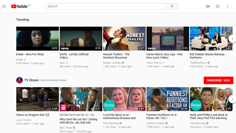
Image source: Youtube
Cards are the best way to present clickable information, especially when you need to present a lot of information in a consumable manner. The boxes usually contain an image along with a short description which helps visitors to get familiar with the type of content available in each of the box. Based on that they can choose the content they like and dive straight into the details by clicking or tapping on the card. Grids of cards work fantastically with responsive designs as the size, spacing, the number of columns, and the style of cards can vary based on screen size. A grid of cards layout is good for content-heavy sites.
5. Featured Image

Image source: Apple
It’s a fact that visuals are the most engaging and attracting type of content. This layout relies heavily on images to create an emotional connection with visitors. A big, bold photograph or illustration of an object makes a strong statement and creates a stunning first impression. Moreover, this layout is best in use when you need to demonstrate a single product/service and want your visitors to focus only on that. Designers must ensure that the image or the illustration used must be of high-quality and relevant to the message you wish to convey to your audience.
6. F-Shape Layout

Image source: Wix.com
This type of layout is based on the way users read content on the web. According to studies, while browsing through the web, users typically move their sight in a particular pattern starting at the top-right corner of the page, moving horizontally, and then drop down to the next line. This is repeated until the user finds something interesting. This scanning pattern is relevant not only for desktop users but also for mobile users. The F-Shape layout is good for pages that need to present a lot of different options and allow users to scan them fast. It is perfect for a news site homepage or page that contains search results.
7. Z-Shape Layout
Image source: UX Planet
The Z-shape layout is also based on the scanning habits of visitors. Unlike the F-Shape pattern, some site visitors start from the top-left corner, moving to the top right, forming a horizontal line, but instead of dropping down directly, as in the F-shaped pattern, their sight moves down to the left side of the page, creating a diagonal line and then they glance back across to the right again, forming a second horizontal line. The Z-shape layout is better suited for sites with a singular goal and less content. This pattern is effective at directing user attention to specific points by using well-placed visuals, text, and CTAs.
Content is the main ingredient of any website. Designers should ensure that the prime objective of any website design is to display the content in an easily consumable manner. They must select the appropriate website layout which makes their content shine outright. Speak to our design experts and know more about design layouts.