5 Trending Ways To Boost Your Web Design Through Colors
Color is one of the main elements when we talk about visual impact. Colors are everywhere around us and also on every single website that we visit. The interesting part is that some of the websites are able to create a stunning impact and appeal through the use of colors while others fail to capture our attention even while using a lot of colors. Designers these days are not hesitant of using bold colors and that too in non-conventional methods. Let’s discuss how colors can be effectively used to boost your web design.
1.Create a Solid Background With Bright Colors
The trend of using solid backgrounds started a few years ago but is still going strong. A colorful and powerful background in a good design can help in focusing towards a specific section. In addition to a minimalist design style, the background is an important design element. A proper mix and match of bright colors in harmony of dark complimenting colors is a great way of highlighting the page design.
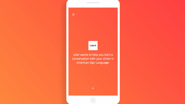
2. Make A Bold Statement
The days of subtleness and sophistication are gone by. Today, designers are using bold colors to make a bold statement. Take a look at this landing page of Uber. The orange gradient background is really eye catching. The core objective of this page is to teach basic sign language which highly relies on visual cues. A bold color scheme along with a bold punchline boosts the superiority of a brand.
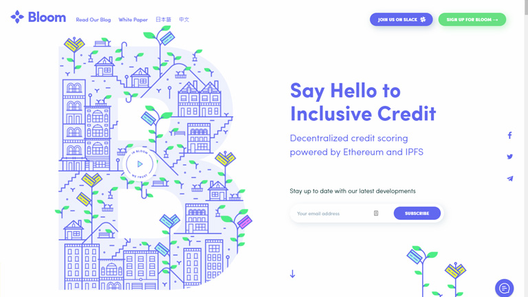
3. Better Storytelling
One of the most important element of storytelling is color. One great way of depicting a story is by using a single color to highlight important sections rather than using different colors. For example, this homepage of Bloom Protocol uses an electric blue color throughout the design. The visual elements along with the color blue helps in guiding the user effectively from the header to the footer. Use of different colors would have broken the flow of the story.
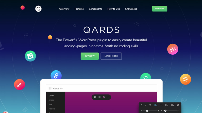
4. Bursts of Interest and Personality Addition
It’s not necessary that large and bold colors need always to be at the forefront or the center for them to be effectively used . Sometimes a color is used specifically to add an interest to a design. Qards landing page uses all sorts of small color bursts to make the landing page look more appealing and pleasant to eyes. The little color bursts create an engagement without making the bright red background look over the top.
5. Pump Up The Branding Of Your Product and Company
Branding of a company is very critical and most of the companies stick to the traditional methods while branding. However, critical use of colors for branding is a newly evolving trend. A lot of websites use heavy colors in some of the sections and not in other sections to balance. Like in the landing page of Stripe. They use gradients between neighbouring colors like blue and green. The design is prominently blue but several other colors like green, pink, orange, and purple are sparingly used.

Conclusion
The time has changed and so have the web design trends. Companies are using bold colors, making bold statements with bright colors, and even branding themselves through colors. This shows how critical colors are when it comes to effective web designing. Moreover, color is a tool that brings out the personality of a company. The use of colors in a web design will only grow with time. Talk to our design experts and see how you can create a stunning website with effective use of colors.
