5 Pro Tips To Design Best CTA Buttons
The technology world has grown leaps & bounds and so has the access to the web. We access the internet to perform a variety of actions ranging from the simplest ones to the most complex actions. There is always a purpose or I must quote “An intention” behind visiting any website. Every visitor has a goal in his mind when he is browsing through a website. However, in a majority of the cases, the visitor is not able to guide himself through the process and complete the action. CTA buttons help a visitor in completing the process. But creating a great CTA button is not everyone’s cup of tea. So, here are 5 amazing tips that will help you create effective CTA buttons
1. Create A Hard-Hitting Crisp Copy
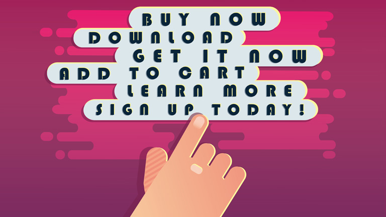
It doesn’t matter how well you design your CTA buttons, or how attractive they look in those flamboyant colors. If the language of your copy is not up to the mark, your CTA buttons will lose their effectiveness. The idea is to keep the message short, sweet, and bang on target. There’s no need to tell a story in this message. It’s recommended that the CTA message must not be longer than 10-15 words. Simple words like ‘Get it’, ‘Do it’, ‘Sign up’, ‘Download’, ‘Purchase now’, etc. are the good old classic examples of an action-oriented and straightforward CTA message.
2. Make Your CTA Button Stand Out From The Crowd
What’s the use of a CTA button if it is not even properly visible on the website? Visitors don’t know the location of your CTA button and they are not going to sweat it out in an effort to find it. Thus, the CTA button must always stand out visually. Here are a few things to remember:
- Your CTA button must not be a tiny dot on the web page. It should be large enough to be noticeable at any given point in time. Having said that, don’t over exaggerate the size factor otherwise it will lead to banner blindness and the purpose will be defeated. Also, make sure that you choose the size based on how it will display on smaller screens especially mobile devices as maximum traffic these days comes from mobile devices only.
- Always use contrasting colors to amplify the effectiveness. Simply pick up the most commonly used colors across your website and design the CTA buttons with opposite or contrasting colors. You can use Red or Orange, in particular, considering they are the highest converting buttons.
- If you are using any images or a custom design in your CTA, make sure that you use only a high-quality image. Moreover, the image must complement the offer you make.
3. CTA Buttons Must Be Placed Sensibly
It’s critical where you position your CTA buttons. You need to make sure that the user comes across them while browsing through the website. Ideally, they must always be placed in the path of the user. As a designer, you must be able to anticipate and predict a user’s behavior and his next move. A lot of marketers use this tried and tested method on their landing pages:
Headline > > > Marketing Copy > > > Capture Form & CTA
The CTA button at the end.
4. Use The Negative Space Effectively
Your web page will have a lot of content and there’s a big chance that your CTA button may lose its visibility by becoming a part of it. The CTA button must always stand out from the other content of the website. To do so, it’s important to manage the negative space around the CTA button effectively.
- Incorporate blank space between your content and your call to action button.
- It’s critical to balance the amount of negative space around the buttons with the size of the buttons themselves.
- The button, the space around it, and the surrounding content must all go hand in hand despite the fact that they are of different sizes.
5. Create A Sense Of Urgency
Whenever someone visits your website he must feel a sense of urgency. The visitor must feel that he must act right away without any delay. Encourage your visitors to act immediately. Don’t give your visitors any reason to pause. Creating a sense of urgency is important, however, don’t mislead your visitors in any way. Also, this technique will work well with the low-cost items and not always for high ticket items.
Converting visitors into customers is the ultimate goal of any business and CTA plays the key role in this process. If you are not able to handhold the visitor in order to complete the desired action, there is a high possibility that he will lose track and bounce off. Also, there’s a lot more to a CTA button than just the button itself. The color, contrast, surrounding, content etc. all play a vital role in deciding the effectiveness of a CTA button. Talk to our experts and understand how you can create better CTA buttons.
